Organizations which design systems (in the broad sense used here) are constrained to produce designs which are copies of the communication structures of these organizations. — Melvin E. Conway, How Do Committees Invent?
Most products don’t start with navigation problems. They develop them as the functionality grows and org structure changes. As Conway’s Law famously describes, software will always end up looking like the org chart.
As capabilities expand, what once felt clear enough becomes a maze. A lot of teams are hesitant to resolve foundational gaps because they’re always solving something more urgent. Business impact is hard to quantify, so it rarely becomes a priority until the damage is done.
I’ve seen this pattern from multiple products and at Level Access, we took a cautious and pragmatic approach to address this gap. A previous team’s redesign effort hadn’t landed with customers. Escalations were coming in. The team had tried targeted fixes, but incremental changes weren’t moving the needle.
What changed wasn’t just the design approach. The key was the conditions and framing around it.
The first motion was our CPO made a deliberate call to treat this as foundational work, not a project that needed to justify its revenue contribution. A dedicated cross-functional team was given focused time. Design, platform, and design system teams worked in coordination rather than in sequence. And lessons from the previous attempt were documented and actually operationalized. One of them was giving users an opt-in and opt-out option during the transition, which we built directly into the go-to-market plan. All of this sounds like common sense but harder to achieve than it sounds.
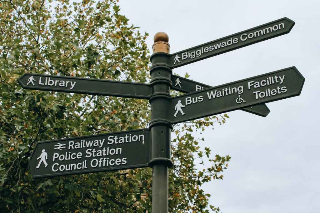
We also took the navigation refresh as a chance to improve accessibility in navigation. Trust me — even products built for accessibility aren’t always accessible. By working closely with accessibility experts (I have to admit meeting their high standard 100% wasn’t possible), the design and dev team incorporated accessibility not just to check the box, but to make sure the experience was customer-centric.
Three accessibility tips stood out:
1. The work starts with words, not with visual designs. Clear labels are the foundation of accessible and scalable user experience. This matters not only to screen readers, but for cognitive accessibility and for anyone new to the product. Before any UI decisions, we asked: can someone understand what this category and menu means from the label alone?
2. Invisible accessibility issues require active hunting. Unlike visible accessibility issues such as color contrast, behaviour related accessibility issues are difficult to catch. Focus state and focus loss are behavioral problems that don’t show up during visual design review. Focus state requires dedicated testing and close collaboration between feature teams and the design system team, where accessibility patterns can be established at the component level. Focus loss should be prevented at the feature design level with explicit instructions to engineering.
3. Modality needs specific attention. Adding AI to an existing SaaS platform doesn’t simplify navigation — it adds a layer on top of what already exists. Designers need to think of multiple entry points and retrofit AI touchpoints without established industry standards. It could be a persistent panel, a modal, embedded inline, a separate destination. There’s no obviously correct answer, and unresolved modality decisions directly compound the invisible accessibility issues. A modal that opens without a clear focus destination. An inline assistant that competes with primary navigation and increases cognitive load. Context switching that multiplies the chances of focus loss.
When technical concerns were pulling us in every direction, our expert’s advice was simple: introducing multiple interactions at once can overwhelm users. This applies to any user, and simplicity and linear progress have been our foundational guidelines. While we haven’t solved all issues, we are committed to further refining accessibility with users in mind.
Two weeks post-launch, 93% of users stayed in the new navigation without toggling back. Qualitative feedback from customer calls has been positive. That’s an early signal, not a verdict. While there is more work to be done, I am proud of what the team has done so far.
This navigation initiative also shaped how I think about AI’s role in design workflows. Intentional work doesn’t become less relevant as AI takes on more of the design and development tasks. Good judgment, clear taxonomy, and the team collaboration behind them are what give AI something worth building on, then keep refining. Intentional information architecture remains the foundation of accessible, usable experiences, whether shaped by humans, AI, or both.
